top of page

50 Years of Manned Space Flight
To commemorate this important anniversary, I tracked down every manned space mission from around the world, the distance traveled and the rocket used to get there. I worked with a graphics editor at National Geographic on the illustration.

Can New Orleans Be Saved?
I did a deep dive into the geography and climate science to help readers understand the challenges ahead. I worked with a cartographer on this.

More from the Katrina Feature

More from the Katrina Feature

More from the Katrina Feature

When Does Life Begin?
With advancement in stem cell research, "The New York Times" asked me to examine religious and political opinions about when life begins against the backdrop of the daily embryonic development. I did the research and design for this.

AP Graphics
At AP Graphics, I hired and reoganized the team. This lead to better design, smarter news judgment and more daily graphics. I oversaw the reporting, editing and design of all graphics.

AP Graphics

AP Olympic Coverage
For AP's Olympic coverage, we integrated more photograpy and photo illustration.

AP Graphics and Editors
I organized the graphics editors by department so that we could build relationships with reporters and create visual stories that helped explain concepts difficult to understand with words alone.

AP Breaking News
Breaking news is the bread and butter of AP. In Graphics, I worked hard to improve on the staff's ability to show what happened even as stories were quickly evolving.

MapShop
At AP, we needed to a tool to make better maps. I struck a deal with Esri to create a SaaS solutions that made creating news maps faster and easier.
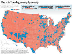
Election Mapping from AP
MapShop also delivered the 2000 election data on a county basis so that newsrooms could create their own maps of the data. Here is an example from USA Today.

Election Mapping for CBS
I lead a team from Esri to create maps of the 2004 election results and explantory demographic maps. The maps were shown on air using a touch screen monitor, years before other networks were doing the same.

Open Data Network
At Voyager Search, we cover the news, too. We keep our open data site up to date with free, topical data from public sources. Today, there are about 40 million map datasources. I was product manager for ODN.

Cyberhomes.com
I was the VP of product management for cyberhomes.com a home listing and valuation site. We also created project that included stories, visuals and most importantly tools that helped give people answers.

A+ Neigbhorhoods
This project from cyberhomes.com helped them find neighborhoods with highly regarded schools and affordable homes.

Highlights of data
This graphic from cyberhomes.com highlighted some of our findings. But users could same information using an interactive map.

Helping Avoid Foreclosure
In 2008, with millions facing foreclosure, many homeowners were confused and scared. Cyberhomes.com created an interactive map of the areas most impacted by the crisis, a photo essay of "feral" homes abandon in the crisis and explained the steps in a foreclosure process to help owners avoid losing their home.

Foreclosure Package Detail
Almost all of Cyberhomes's stories were not presented in a linear manner. Users could easily dip into the details just where they needed it.

Going Green
Cyberhomes.com also showed homeowners how to cut costs and boost the value of their homes by going green. The package included videos and DIY tips.

Find the Right Neighborhood...
At cyberhomes.com, we flipped the idea of how to find a home on it’s head. With more Americans moving far from family, where to live is not always as easy finding a place you can afford. You might be able to find a great house, but what if you have nothing in common with your neighbors?

Hear from People about their Neighborhood...
We did video interviews with representatives of each psychographic segment in areas people in that segment congregated and actually defined the character of the place.

See What Kind of People Live There...
The users could then explore the data behind the segments like age, income, spending habits, education levels as well as brand preferences, media habits and hobbies to see if their neighbors sounded like someone they'd befriend.

Now, Find a Home.
Users could find matching neighborhoods across the country. And once they had settled on something they liked, they could start looking for a home there.
50 Years of Manned Space Flight
To commemorate this important anniversary, I tracked down every manned space mission from around the world, the distance traveled and the rocket used to get there. I worked with a graphics editor at National Geographic on the illustration.
Can New Orleans Be Saved?
I did a deep dive into the geography and climate science to help readers understand the challenges ahead. I worked with a cartographer on this.
More from the Katrina Feature
More from the Katrina Feature
More from the Katrina Feature
When Does Life Begin?
With advancement in stem cell research, "The New York Times" asked me to examine religious and political opinions about when life begins against the backdrop of the daily embryonic development. I did the research and design for this.
AP Graphics
At AP Graphics, I hired and reoganized the team. This lead to better design, smarter news judgment and more daily graphics. I oversaw the reporting, editing and design of all graphics.
AP Graphics
AP Olympic Coverage
For AP's Olympic coverage, we integrated more photograpy and photo illustration.
AP Graphics and Editors
I organized the graphics editors by department so that we could build relationships with reporters and create visual stories that helped explain concepts difficult to understand with words alone.
AP Breaking News
Breaking news is the bread and butter of AP. In Graphics, I worked hard to improve on the staff's ability to show what happened even as stories were quickly evolving.
MapShop
At AP, we needed to a tool to make better maps. I struck a deal with Esri to create a SaaS solutions that made creating news maps faster and easier.
Election Mapping from AP
MapShop also delivered the 2000 election data on a county basis so that newsrooms could create their own maps of the data. Here is an example from USA Today.
Election Mapping for CBS
I lead a team from Esri to create maps of the 2004 election results and explantory demographic maps. The maps were shown on air using a touch screen monitor, years before other networks were doing the same.
Open Data Network
At Voyager Search, we cover the news, too. We keep our open data site up to date with free, topical data from public sources. Today, there are about 40 million map datasources. I was product manager for ODN.
Cyberhomes.com
I was the VP of product management for cyberhomes.com a home listing and valuation site. We also created project that included stories, visuals and most importantly tools that helped give people answers.
A+ Neigbhorhoods
This project from cyberhomes.com helped them find neighborhoods with highly regarded schools and affordable homes.
Highlights of data
This graphic from cyberhomes.com highlighted some of our findings. But users could same information using an interactive map.
Helping Avoid Foreclosure
In 2008, with millions facing foreclosure, many homeowners were confused and scared. Cyberhomes.com created an interactive map of the areas most impacted by the crisis, a photo essay of "feral" homes abandon in the crisis and explained the steps in a foreclosure process to help owners avoid losing their home.
Foreclosure Package Detail
Almost all of Cyberhomes's stories were not presented in a linear manner. Users could easily dip into the details just where they needed it.
Going Green
Cyberhomes.com also showed homeowners how to cut costs and boost the value of their homes by going green. The package included videos and DIY tips.
Find the Right Neighborhood...
At cyberhomes.com, we flipped the idea of how to find a home on it’s head. With more Americans moving far from family, where to live is not always as easy finding a place you can afford. You might be able to find a great house, but what if you have nothing in common with your neighbors?
Hear from People about their Neighborhood...
We did video interviews with representatives of each psychographic segment in areas people in that segment congregated and actually defined the character of the place.
See What Kind of People Live There...
The users could then explore the data behind the segments like age, income, spending habits, education levels as well as brand preferences, media habits and hobbies to see if their neighbors sounded like someone they'd befriend.
Now, Find a Home.
Users could find matching neighborhoods across the country. And once they had settled on something they liked, they could start looking for a home there.
bottom of page